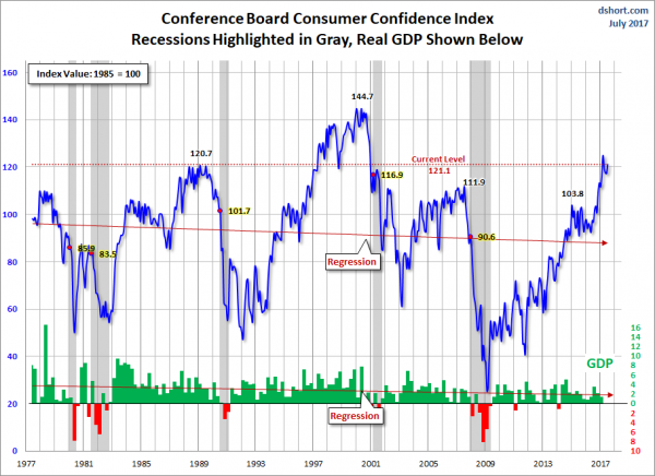
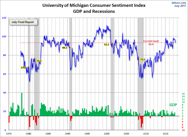
All charts reflect quarterly data through the 2nd quarter of 2017, and were last updated as of July 28, 2017. As one can see, two of the three measures are at an all-time low for the periods depicted:
Velocity of MZM Money Stock, current value = 1.293:
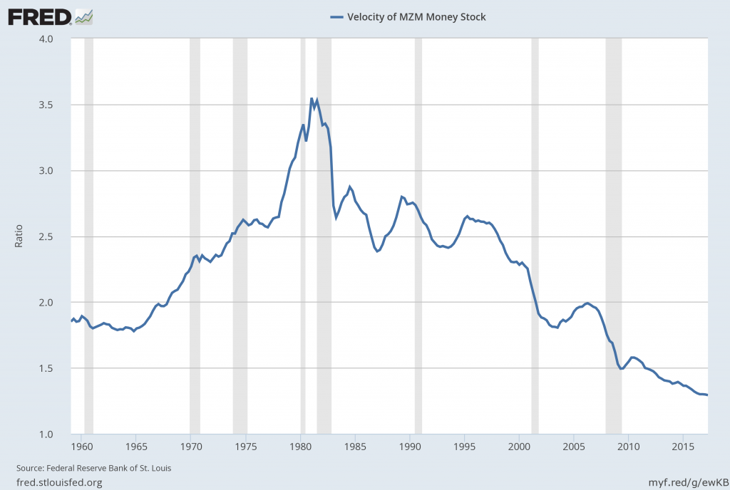
Data Source: FRED, Federal Reserve Economic Data, Federal Reserve Bank of St. Louis; accessed July 29, 2017:
http://research.stlouisfed.org/fred2/series/MZMV
–
Velocity of M1 Money Stock, current value = 5.528:
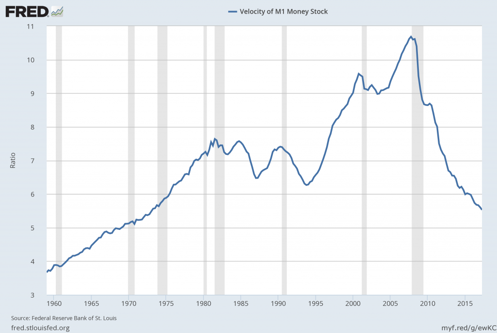
Data Source: FRED, Federal Reserve Economic Data, Federal Reserve Bank of St. Louis; accessed July 29, 2017:
http://research.stlouisfed.org/fred2/series/M1V
–
Velocity of M2 Money Stock, current value = 1.425:
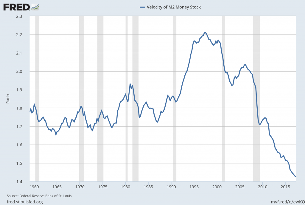
Data Source: FRED, Federal Reserve Economic Data, Federal Reserve Bank of St. Louis; accessed July 29, 2017:
http://research.stlouisfed.org/fred2/series/M2V
_________
I post various indicators and indices because I believe they should be carefully monitored. However, as those familiar with this site are aware, I do not necessarily agree with what they depict or imply.
_____
The Special Note summarizes my overall thoughts about our economic situation
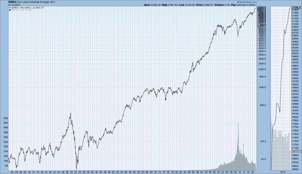
SPX at 2472.10 as this post is written